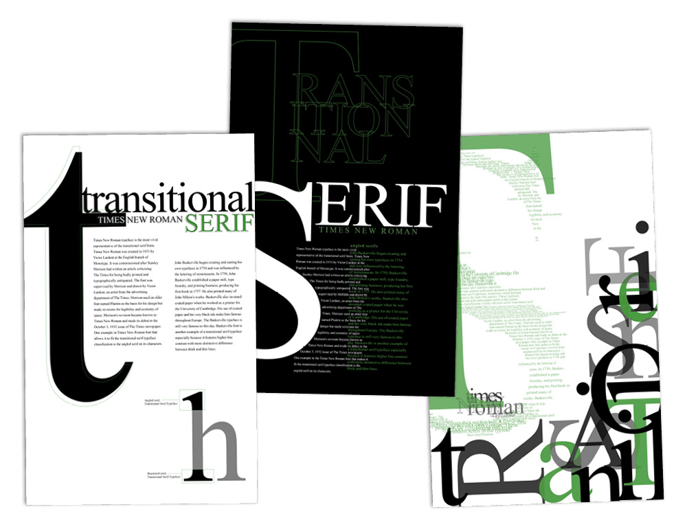
This poster series is an exploration in the art of typography. I took a commonly used typeface that is usually seen as boring and created three comparative compositions. Times New Roman is a transitional typeface and the star of these three posters. The first design is the most simple in layout and form, although it does have a few elements that help break the normality of it. The second poster transitions into a more complex composition with the use of overlapping and intertwining lines of type. The third design is the most dynamic composition by essentially breaking all the rules. I push the boundaries of readable text and add extreme typographic texture by playing with the type size, weight, opacity, tracking, leading, and the balance of the rag. The title, “Transitional Serif”, balances out the design by being jumbled along the bottom and right corner of the design and adds contrast with its density.